Do you feel like your restaurant website isn’t quite living up to its potential? Are you using online food ordering platforms over your delivery system? If you answered with “yes” to any of these questions, we’ve got you covered.
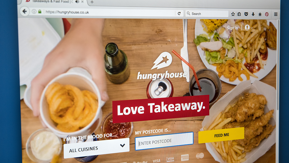
Online food ordering platforms such as DoorDash are very popular, but they're not for free. So, don't waste your money on yet another one. Instead, think long-term and invest in professional website design.
A web design company with extensive experience will not only help you boost online orders but also attract new customers. After all, why would you turn down new people that want to visit your restaurant in person?
Regardless of your choice here, we give you five tips you can use to boost your online orders.
Be Consistent When Using Your Theme
A website theme is basically the foundation for the rest of the web design. It's about the type and size of the fonts, the color schemes, and the overall website aesthetics. It’s a big part of making your brand work online.
Being consistent with your theme is essential for a couple of reasons.
First, elements that are not in line with your theme will seem out of place. Your online visitors and in-person guests will notice that. And if they don't like it, they will abandon your website without even proceeding to the ordering page.
And that’s not all.
Using your theme consistently is a way of building your brand identity. It's all about getting your consumers to distinguish your restaurant from others. To achieve that, use your logo, specific colors, and fonts on your website consistently.
It's all about getting your consumers to distinguish your restaurant from others. The best way you can achieve that is by using specific colors, fonts, and other elements consistently.
Highlight the “Order Now” Button

If you want to boost your online orders, you need to make the “Order Now” button your call-to-action (CTA) button. A CTA button is a button that tells users to do something by clicking on it – explore a specific webpage on your website, purchase the product, or (in your case) order food from your restaurant.
An “Order Now” button needs to be visible to users as soon as they land on your website. You can achieve that by using a different color to make it stand out, or playing with its shape, for instance. Putting it at the top of the page, such as on your menu bar, is also a good idea since that’s where users first look. If they need to scroll below the fold to find it, you risk losing them.
The goal isn’t to be unique here, but to provide users with what they’re already used to. We advise you to check out your competitors’ landing pages and those of other top restaurants, and see how they do it.
Organize Your Menu

Imagine being hungry and scrolling through over thirty different dishes. It takes forever to find that sandwich you like, right?
So, organize your dishes into different categories such as Breakfast, Salads, Dinner, Dessert, etc. Of course, how you name your categories will depend on your dishes, but it’s good to organize your ordering menu. It’s also important to review your menu from time to time and include new dishes.
Every item on the menu should have a description stating the ingredients. This is especially important to those with allergies. You don't want them to end up in a hospital, do you?
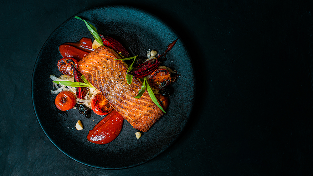
Descriptions are also a great opportunity to entice your customers and get them to order. Talk about the appearance, texture, and taste. Emphasize fine quality and unique ingredients you’ve included in your dish. Use words like vibrant, leafy, encrusted, buttered, juicy, kneaded, local, and meticulously to describe a dish. Don’t forget to include catchy photos of the dishes. People are very visual.
By the way, did we already make your mouth water?
Make Sure Your Website is Mobile-Friendly

According to the research found on Statista, there were 6,259 million smartphone users in the world in 2021. This number is projected to grow to 7,60 million by 2027.
People rely on their smartphones in everyday life a lot. The possibilities are pretty much limitless: you can send emails, watch movies, listen to music, and even edit document files on your smartphone. It should come as no surprise that Starbucks reported that nearly a quarter of all US orders in 2020 were placed on a mobile app.
So, it’s time to prepare yourself.
For starters, make sure your CTA button is at the top of the page, so people can see it right away. It’s especially important to ensure your online menu doesn’t look cluttered with elements and descriptions. Photos of dishes should be large enough so that users can see them on their mobile phones.
And, the website should run smoothly on all devices, with no bugs. Ensure there are no staggering and especially no bugs during the checkout.
Put Your Best-Selling Dishes at the Top
You’ve probably noticed that some menu items are more popular than others. Well, what better way to promote them to your customers than to put them at the top of your ordering menu? Your new customers will probably feel the same way, which means they’ll order food from your restaurant again.
Aside from the best-selling dishes, you can also include those that bring in a high-profit margin. Just make sure they’re tasty because you only have one shot at impressing new customers.
As you can tell, it’s necessary to alter your website if you want to have successful online ordering. You need to guide users through the ordering process all the way from your landing page to the checkout.
Remember -- boosting your online orders comes down to creating an easy-to-use website with an appealing interface. So, examine your website and be honest with yourself. Does your CTA stand out? Are you sticking to your website theme?
If not, set a goal and start applying these tips one by one to boost online orders.